


 105 / 116

TECHNIQUES FOR IMAGE PROCESSING
If you’re a Lightroom user, converting to black and white
is easy. Although there are a couple of ways to turn your
image black and white in Lightroom, I suggest going
straight to the B&W panel in the Develop module. Simply
click B&W
,
and your image is converted. The trick is in
stylizing what you’ve captured. Here are a few styles to
try for your monochromatic workflow.
High-key and low-key.
A high-key image is inherently bright
in tone, while a low-key image is inherently dark in tone.
With many blue-water images, creating either look can
be achieved with a simple wave of the mouse. In Figure 1,
notice the small icon in the upper left of the panel. This is
called the Targeted Adjustment tool (TAT), and if you click
on it, your cursor turns into a crosshair. With this crosshair
you can click and drag your mouse on any color in your
image that you want to adjust. Click and drag upward for
one effect, and drag downward for another.
To create a high-key image, click and drag your mouse
upward. Notice as you do that the blue
slider in the
B&W panel moves to the right, and all the blue tones are
brightened, as shown in Figure 2. To create the opposite
effect, or a low-key image, you’ll want to click and drag the
mouse downward. Note that it’s rare to have an image that
can work as either a high-key or a low-key image. They
usually work as one or the other; experiment to figure out
which. Moving just the blue slider left or right will likely be
the first in a series of steps to develop the image’s final look.
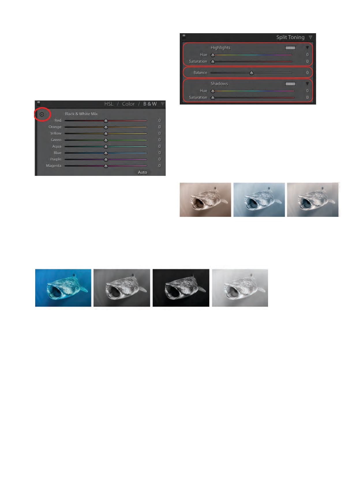
Color toning.
In addition to the straight black-and-white
look, you can also tone images. To tone your black-and-
white images, look no further than the Split Toning
panel. There are three sections to this panel, as shown in
Figure 3. You can control the hue and saturation of your
highlights and shadows, or you can shift the balance of
the two to favor one or the other. My personal preference
is to warm-tone images, which imparts a sepia feel. I
especially like this look for printing, but Figure 4 shows
three different ways you can tone your work. The first
image is warm toned, the second cool toned, and the
third is split toned.
To create a warm tone, I suggest setting your Hue
slider in Highlights and Shadows to 35, and then slowly
moving the Saturation slider to the right to taste. Feel
free to adjust
the Hue slider in
either direction
to fine tune it to
precisely what
you like, but I’ve
found 35 to be
a good number
for warmth. Cool
toning an image is similar to warming; just begin with
your Hue slider at 220. To split tone, try splitting the
difference, but play and experiment as you go. You can
set your Highlights to 220 and your Shadows to 35, or
visa versa. Whichever direction you choose, toning can
help create just the feel or style you’re looking for.
Treat my suggestions as starting points for a process
that will take you toward a photographic style that only
you can discover. Whether you simplify your camera
gear and dive without strobes, focus on uncomplicated
backgrounds or shift your approach from photographing
creatures to focusing on patterns, shapes, textures,
tones and moods, the trick for finding what you like
is to continue to experiment and be playful with your
photography.
AD
ALERTDIVER.COM|
103
Figure 2: Starting with the image on the far left, we have our original color image followed by the unaltered black
and white. The third image moves the Blue slider to the left, thereby darkening the blues, and the fourth image
moves the slider to the right, lightening the blues.
Figure 4: The first image on the far left is warm toned, the middle
image is cool toned, and the third image is split toned with warm
highlights and cool shadows.
Figure 1
Figure 3